
University of Michigan Lecture Viewer
A comprehensive functional and aesthetic redesign of the UofM’s outdated lecture viewing system

. . .
Overview
Roles
User Experience Designer
Client
CAEN, the IT department of the University of Michigan College of Engineering
Timeline
August 2019 (1 month)
Skills
Sketching, Wireframing, Prototyping, Usability testing
Team
John Pariseau (Supervisor, PM, Developer)
Tools
Adobe XD
Problem
The University of Michigan Lecture Viewer is an internal system that allows students to watch recorded lectures and follow along with presentation slides, just like in the classroom. The Lecture Viewer is highly popular among students, with over half the UofM student body having used the system before.
During the Summer of 2019, it was decided that a plethora of new features would be added to the lecture viewer to further support students’ educational needs. Such features included a whiteboard view, a transcript view, a pop quiz feature, and more.
Problem Statement: In order to accommodate all the new features, the outdated user interface of the University of Michigan Lecture Viewer required a major redesign.
Solution
I led the redesign of the University of Michigan Lecture Viewer, designing and implementing new features to promote the empowerment of student users while also refreshing the system’s user interface and style.
My Contribution
As the lead UX designer, I was in charge of the Lecture Viewer’s design. I worked closely with John, who took on the roles of being both the Product Manager and the lead Developer.
. . .
Research
User Research
Given the circumstances of being on such a small team (of 2 people) with limited resources and a short timeframe, I was unfortunately not provided with the opportunity to conduct any official user research.
However, to ensure that the product met user requirements, I continuously asked my friends for their feedback on my designs throughout the entire design process. Furthermore, I advocated for conducting usability testing sessions at the end of the project.
However, to ensure that the product met user requirements, I continuously asked my friends for their feedback on my designs throughout the entire design process. Furthermore, I advocated for conducting usability testing sessions at the end of the project.
Identified Problems
After exploring the current Lecture Viewer and talking with other students about their complaints with the system, I was able to identify 3 main problems.
- Restrictive: The Lecture Viewer restricts users and limits their control over the system. The user interface is filled with many rigid presets, providing little means for user customization.
- Unintuitive: Compared to other video players, the user interface is both confusing and unintuitive. For example, the buttons on the control bar seem randomly split between the left and right sides of the screen.
- Outdated: The system’s design is extremely outdated. Its interface is full of unattractive gradients, reminiscent of the old Windows XP interface.
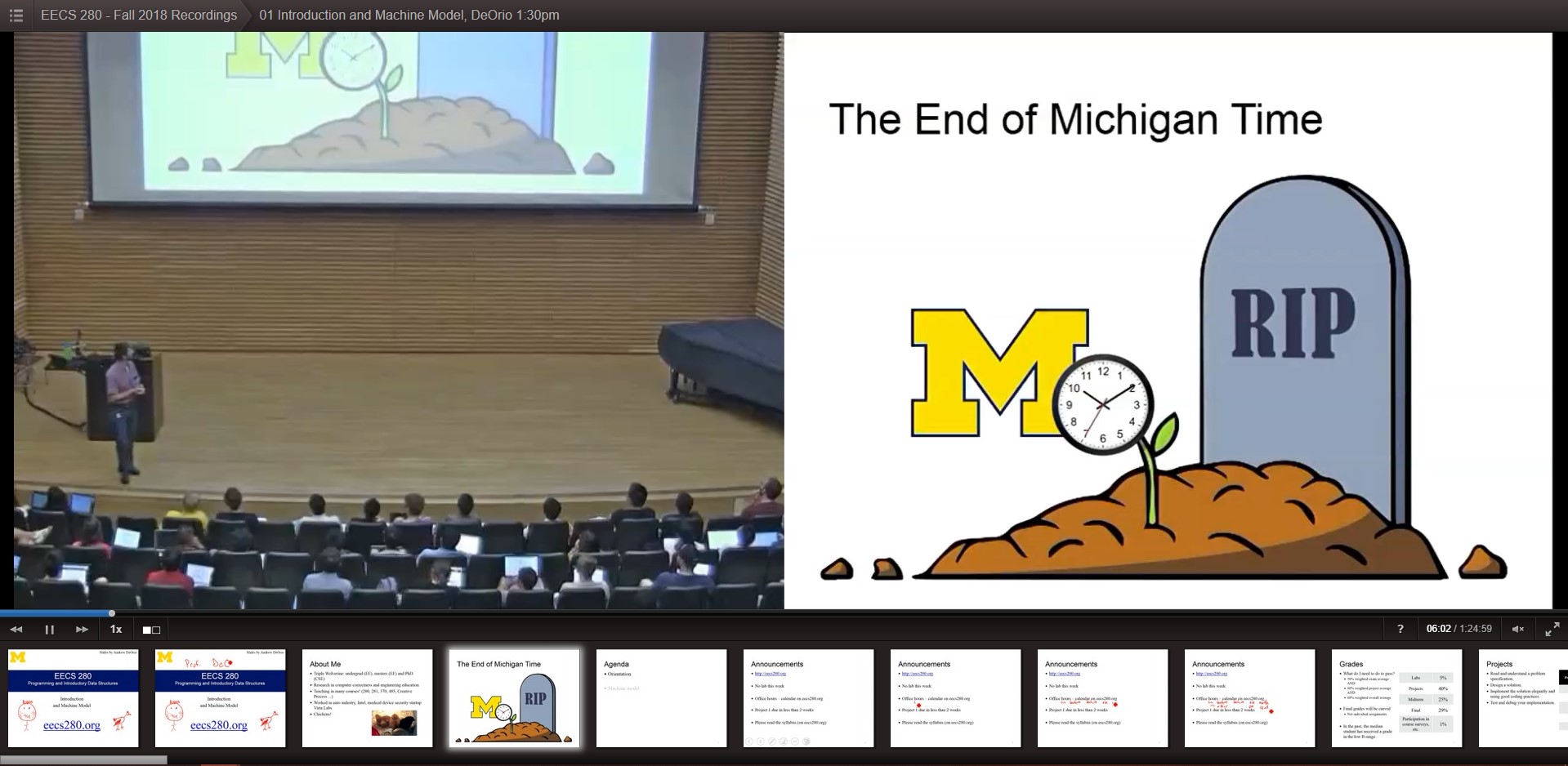
The University's existing Lecture Viewer system
Design Goals
Taking these problems, I decided to translate them into more concrete design goals for the Lecture Viewer’s redesign.
- Empower Users: The redesigned user interface should aim to empower users by providing students with an intuitive interface that supports increased flexibility and customization.
- Continuity: Almost all students are extremely familiar with the current lecture viewer. As a result, the redesigned viewer should aim to preserve users’ existing mental models through both behavioral and appearance-based similarities to the current system.
- Modern Design: The design of the Lecture Viewer’s user interface should be catered towards the current generation of students, without sacrificing the usability.
. . .
Design
Methodology
With the addition of so many new features, almost every aspect of the lecture viewer required a redesign. I decided to proceed with a top-down approach, starting with the larger, more encompassing features. My process involved:
- Identifying existing pain points and areas of improvement
- Exploring possible solutions through sketching, wireframing, and prototyping
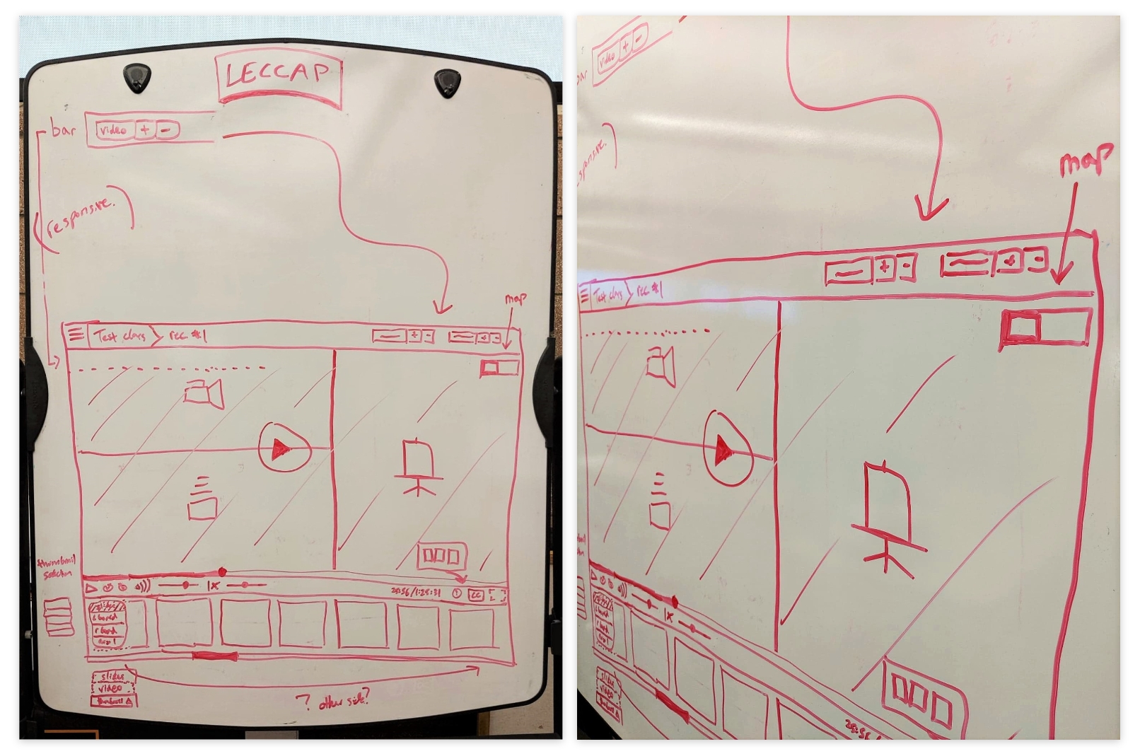
Some of my initial sketches of the redesign
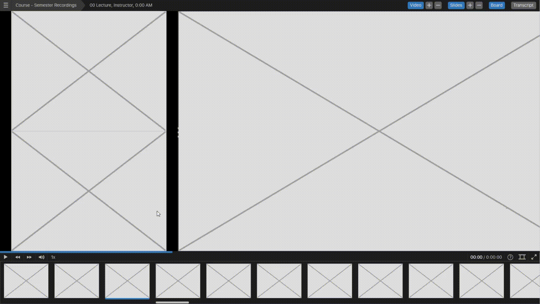
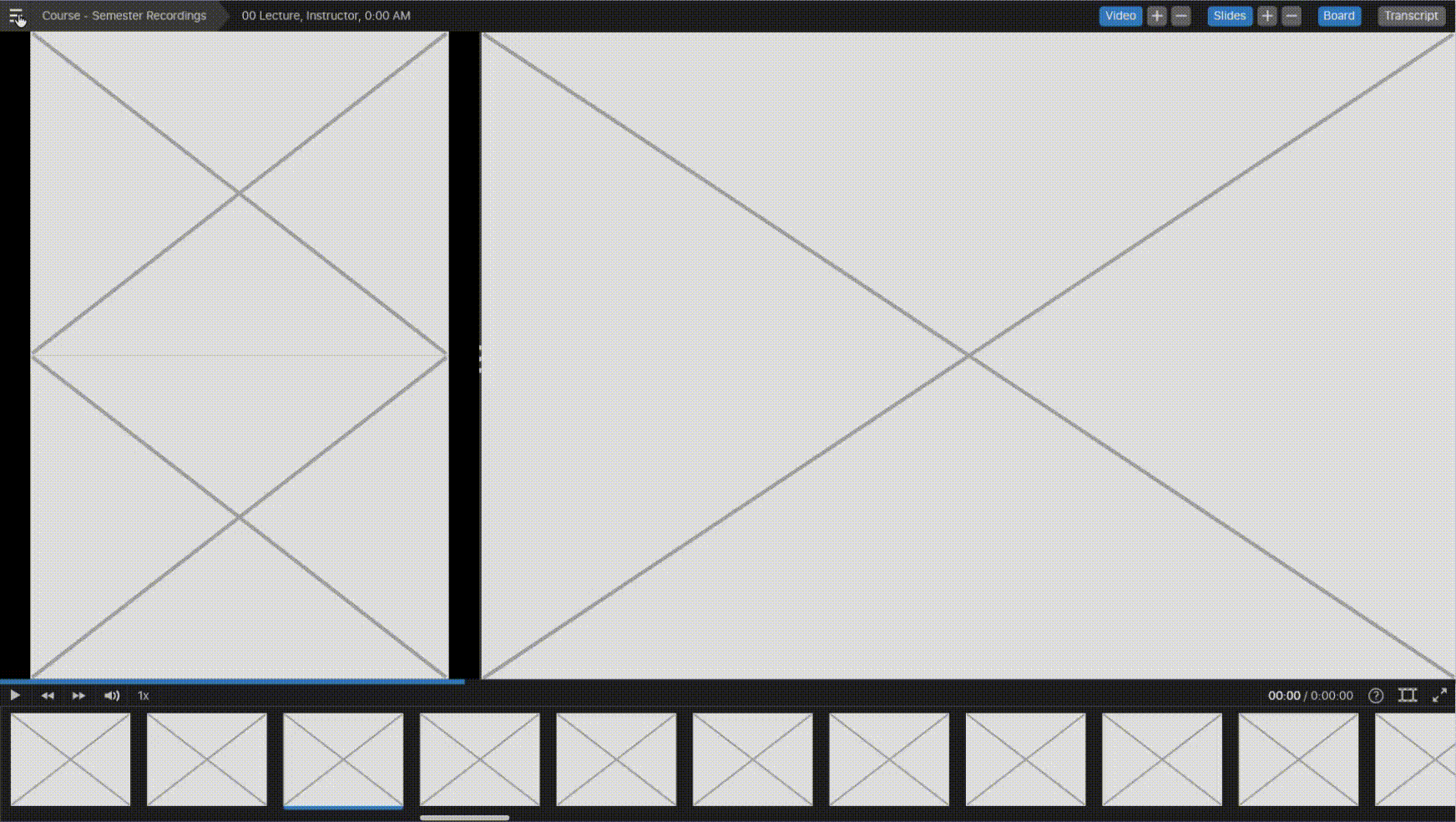
Redesign: Sources and Window Sizing
The main section of the lecture viewer consists of multiple resizable windows that display a variety of sources. The current lecture viewer displays a maximum of 2 sources (classroom video and the presentation slides) that can be shifted around and resized with presets.
Problem: With the addition of whiteboard, transcript, and extra auxiliary sources, the new lecture viewer would need the ability to display up to 6 sources at once. With so many sources, how can users resize windows and customize their viewing area?
After brainstorming, I came up with 4 different solutions. I then individually prototyped these solutions to further explore their pros and cons:
- Presets
- Overlaid Controls
- Attached Controls
- Separated Controls
Presets of the existing Lecture Viewer system used to position and resize windows
1. Presets
Presets were immediately taken out of the picture, as they would only continue to limit users’ flexibility. Furthermore, they were not feasible with the greater number of sources.
Pros:
Pros:
- Same method of control as the existing Lecture Viewer
Cons:
- Restrictive
- Not feasible with the greater number of windows
2. Overlaid Controls
When users hover over the source window, the controls to resize the window appear as an overlay.
Pros:
Pros:
- Intuitive controls: users would be able to easily understand what the buttons do and which window they control
Cons:
- Users are unable to click anywhere to play/pause the video
- The overlay blocked the video underneath
- The buttons scale with window size, and could become too small to click
3. Attached Controls
When users hover over the source window, the controls to resize the window appear next to the window.
Pros:
Pros:
- Intuitive controls
- Consistent button size
Cons:
- To repeatedly adjust the window size, users need to chase the controls around
- The buttons could overlap with other source windows
4. Separated Controls
The controls of all source windows would be placed in a separate bar at the top of the screen.
Pros:
Pros:
- Allow users to easily and repeatedly resize windows
- Does not obstruct the viewing area
- Allows users click anywhere to play/pause
Cons:
- Introduces a physical disconnect between source windows and their controls

Solution:
While Solutions #2 and #3 had intuitive controls, their negatives are recurring and could easily end up frustrating users.
Solution #4 avoided the downsides of #2 and #3, but introduced a disconnect between the source windows and their controls. The downside of this solution was that users would probably need to learn how the system works their first time. To alleviate this issue, labels were added to source windows once users hovered over their respective controls.
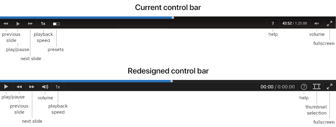
Redesign: Control Bar
Problem: The lecture viewer’s current control bar is confusing, with seemingly no correlation between the buttons grouped on the left and right.
Solution: As we are trained to read from left to right, I believe that the most important buttons should be placed on the left side, while the optional settings are placed on the right side. Additionally, the most commonly used buttons, such as the play/pause and full screen buttons, should be in the corners where they are quick to find and easy to click.
After referencing other video players on the market, the reasoning behind my design was further reinforced.
New: Whiteboard View
The whiteboard view displays what is wrote on a classroom whiteboard.
Problem: Given that the width of a physical whiteboard will most likely exceed the width of the viewing window, the whiteboard window will be pannable. However, the design must be able to signify users that the whiteboard can be scrolled and panned.
Solution: To achieve this, a small minimap appears when users hover over the whiteboard. This feature effectively provides users with a clue that the whiteboard can be scrolled, while also indicating their current position.
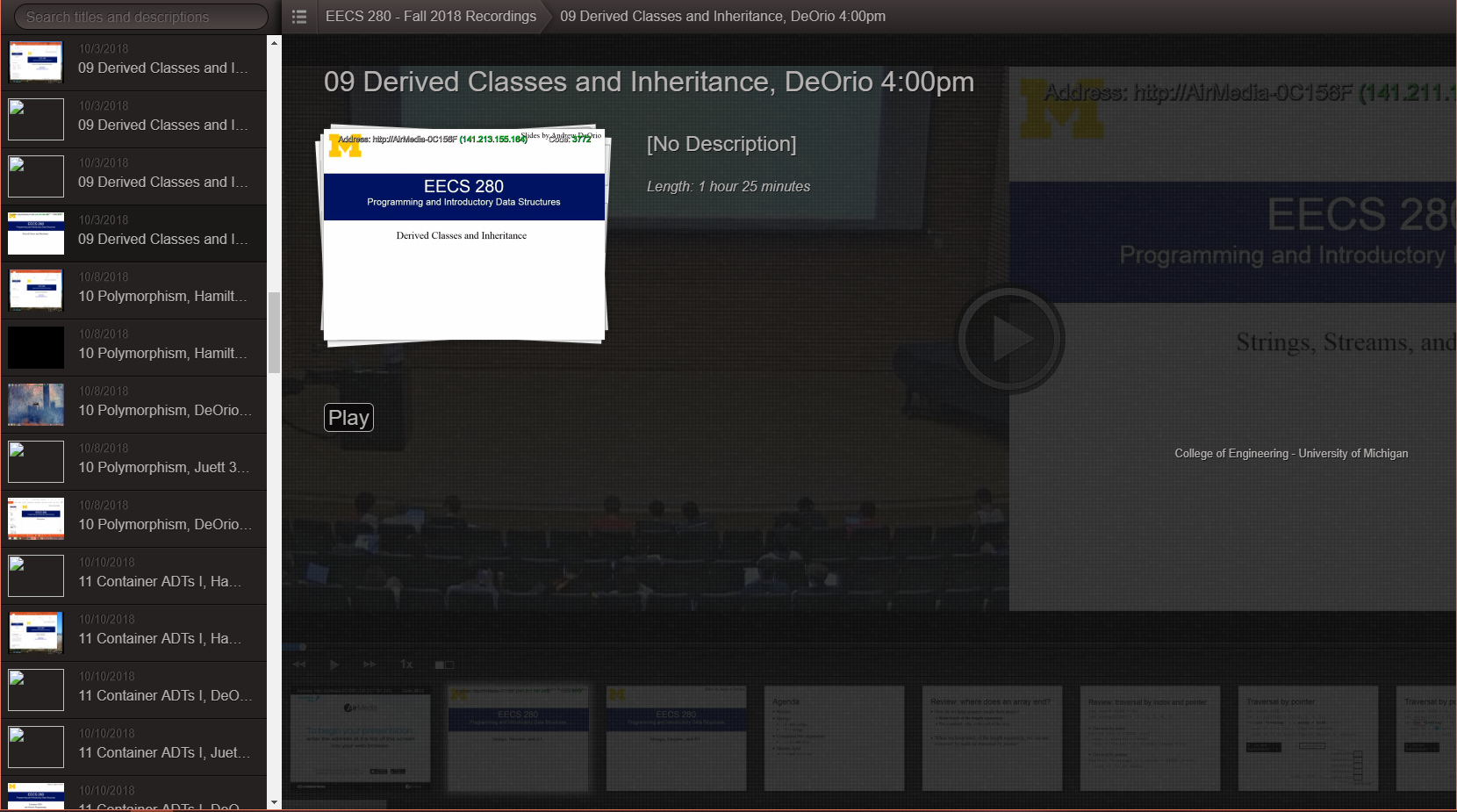
Redesign: Recordings Library
The recordings library displays other recordings, along with their basic information.
Problem: The existing recordings library features a two-column layout, with a list of recordings on the left and a detailed view on the right. However, the narrow left column requires users to endlessly scroll through lectures while the detailed view wastes a ton of space.
Solution: The redesigned library balances these 2 elements, effectively utilizing the screen’s space to better display information and streamline user interaction.
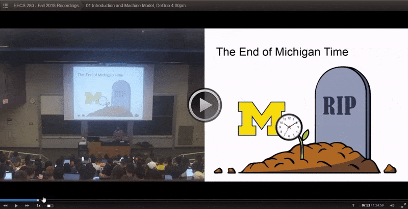
The existing recordings library
The redesigned recordings library
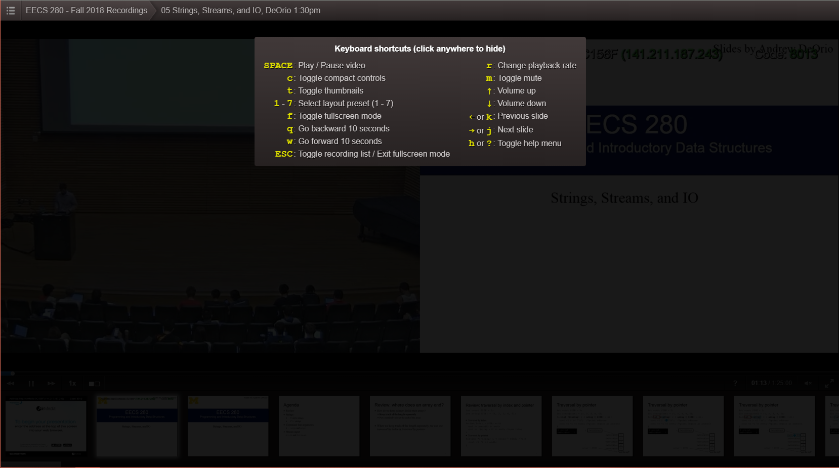
Redesign: Help Window
The help window displays helpful keyboard shortcuts and tooltips.
Problem: The current help window unnecessarily blocks the entire screen without pausing the video.
Solution: The redesigned help window features a smaller pop-up that appears in the corner of the screen, without disrupting the playing video. Additional tooltips that explain how the Lecture Viewer’s new features work can also appear.
The existing help window
The redesigned help window
Style & Typeface
The redesigned Lecture Viewer received a modern facelift, with outdated gradients and sharp edges being replaced with solid tones and rounded corners. The redesigned viewer retains the original dark color scheme, but with additional white and blue accents to signify interactive elements.
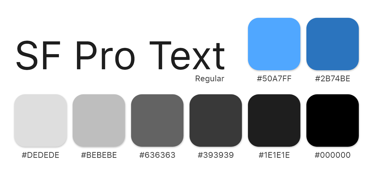
SF Pro was selected as the lecture viewer’s typeface, as it is legible, modern, and consistent with other CAEN products.
SF Pro was selected as the lecture viewer’s typeface, as it is legible, modern, and consistent with other CAEN products.
Evaluation & Iterations
We conducted usability tests with 5 students and 4 faculty members with the purpose of identifying users’ pain points and insights and pinpointing any additional design changes.
Surprisingly, the participants had little to no trouble completing assigned tasks, even when they involved the Lecture Viewer’s brand new features. The general consensus was that the redesigned system was a drastic improvement over the existing version.
Surprisingly, the participants had little to no trouble completing assigned tasks, even when they involved the Lecture Viewer’s brand new features. The general consensus was that the redesigned system was a drastic improvement over the existing version.
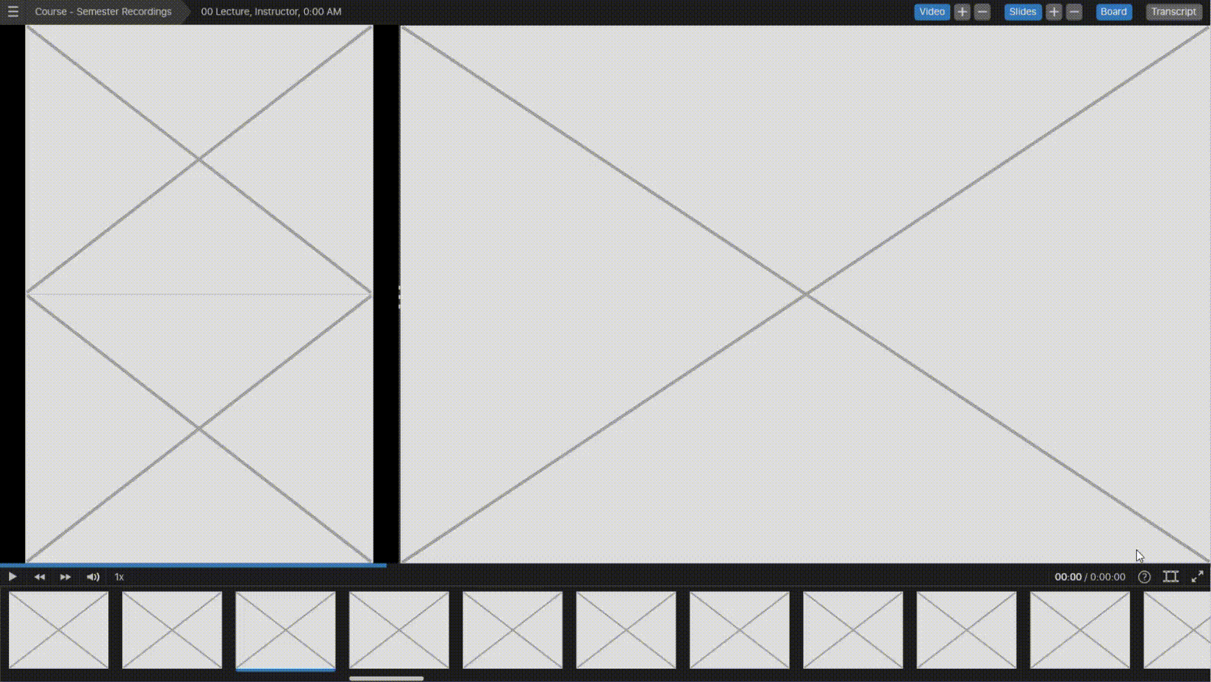
Disconnect Between Source Windows and Controls
From the results of our usability test, we discovered that disconnect between source windows and their controls still existed, even with the addition of labels. In order to provide users with better signifiers, additional colored borders were added around source windows. These borders would then appear when their respective controls are hovered over.
. . .
Latest Prototype
. . .
Future Steps
The redesigned Lecture Viewer is currently undergoing beta testing with a few select classes where it will be tested by a larger number of users. Following the beta test, we will be sending out surveys to students and asking for volunteers to interview in order to gather additional feedback. The lecture viewer will then undergo additional iterations of design and development to continuously improve the system.
. . .
Reflection
The Need of User Research
Prior user research would’ve been incredibly useful to determine the system's user requirements. While I spent countless hours brainstorming and designing solutions, much of it would be meaningless if it did not meet user needs. For this project, I was fortunate enough to be a part of the user group (as a student myself) and have easy access to many other students; however, this is certainly not the case for all projects.
The Value of Usability Testing
Real users often see things that designers and developers can easily overlook. Even with our quick and informal usability testing session, many small but crucial changes were identified.
There are Never too Many Ideas
There is no such thing as brainstorming too many solutions. Other solutions can always be used in the future through methods such as A/B testing to continue improving the product.
. . .
Thanks for making it this far! You've unlocked another one of my fun facts:
I learned how to cut my own hair in high school from watching YouTube, and now I haven't been to a barbershop in years
I learned how to cut my own hair in high school from watching YouTube, and now I haven't been to a barbershop in years